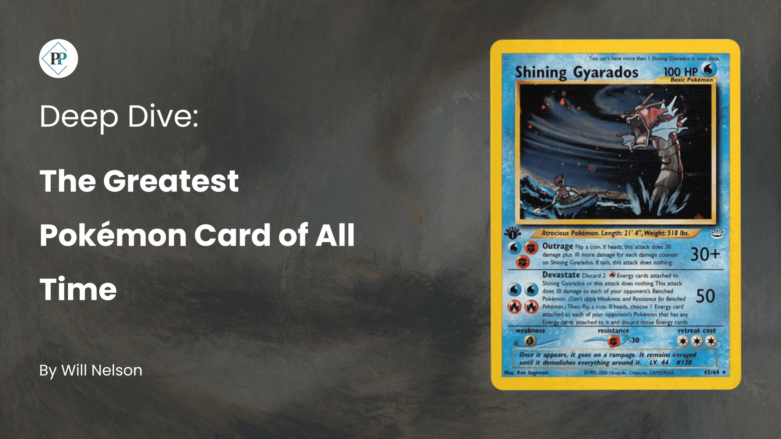
Introduction
In this blog we will put the artwork of Miki Tanaka in the spotlight. Tanaka is one of the longest-standing and most unique artists in the Pokémon TCG.
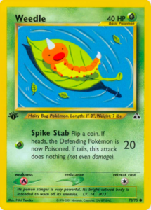
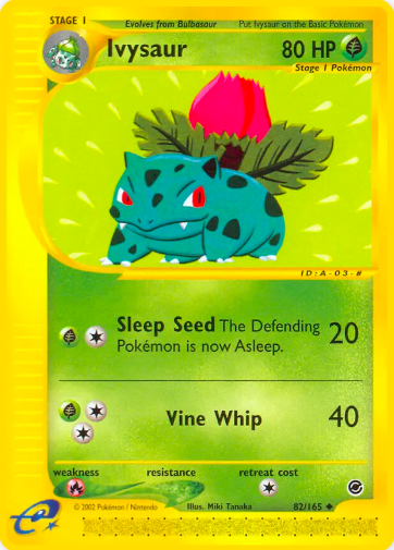
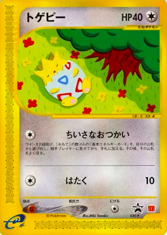
Illustration by Miki Tanaka
Tanaka illustrated her first card in 1997 in Fossil (the third ever mainline expansion of of the Pokémon TCG). To date, Tanaka has illustrated over 180 cards, and her artwork still regularly appears in modern expansions.
Tanaka’s work is immediately recognisable due to its simplistic and minimalist style, which at times borders upon the abstract. Tanaka also often incorporates patterns in her work, with a particular emphasis upon patterns in nature.
In this blog, we will put Tanaka’s work in the spotlight. We will take a look at a selection of her cards, and highlight the main features of her artwork. We will also pick out Tanaka’s top three cards.
Miki Tanaka’s Artwork
Features of Tanaka’s Artwork
In this section we will review three of the most notable features of Tanaka’s artwork for the Pokémon TCG.
Simplicity and Minimalism
The first and most obvious feature of Tanaka’s work is its simplicity and minimalism. Almost all of Tanaka’s works are illustrated in a simple and distinctly two-dimensional style.
Simplicity and Minimalism
Tanaka’s works are also simplistic in terms of their use of colour, typically making use of only three or four block colours. Additionally, Tanaka typically depicts simple and minimalist compositions, usually based upon a single motif or design element.
Tanaka’s simple and minimalist style can often feel like a breath of fresh air amongst the complex and detailed artwork that is generally seen within the Pokémon TCG. Her work has a calming and relaxing impression.
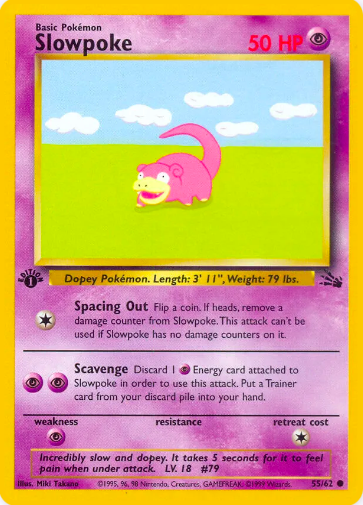
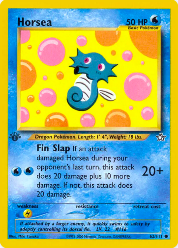
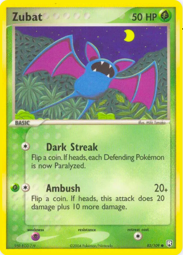
Basic Pokémon
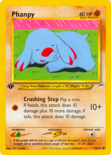
The second feature of Tanaka’s artwork is that Tanaka almost exclusively illustrates weak and basic Pokémon. This is understandable, as these Pokémon naturally lend themselves to Tanaka’s simple and minimal style. Indeed, one could hardly imagine a Charizard or Mega Gyarados in Tanaka’s style.
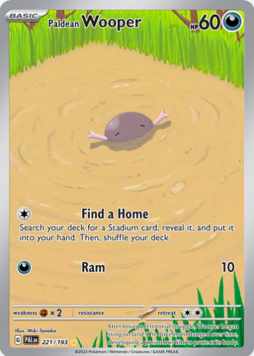
Basic Pokémon
Tanaka’s colourful, unique and visually appealing artworks manage to bring interest to even the weakest and most basic Pokémon. Although they may not be as rare or shiny as the chase cards in any given set, Tanaka’s cards are often no less desirable (and are a LOT cheaper!). Tanaka’s work reminds us not to overlook the basic Pokémon.
Pattern
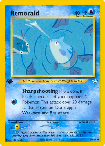
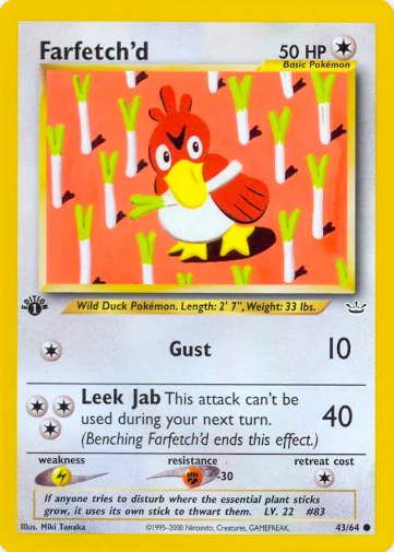
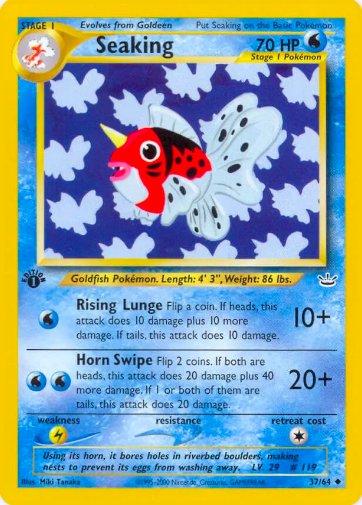
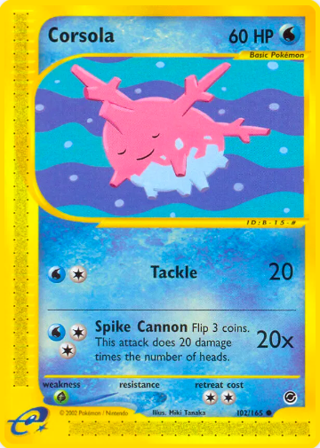
The third notable feature of Tanaka’s work is her use of pattern, with a particular emphasis upon patterns in nature. Some of these patterns are very obvious, such as the patterns in the below Farfetch’d, Seaking and Corsola cards. Other patterns are more subtle, such as recurring patterns amongst the foliage or scenery in the background of the card. Most of Tanaka’s cards have some sort of pattern, if the viewer looks hard enough.
Use of Pattern
Tanaka’s use of pattern is another stylistic feature that adds to the simplicity of her cards, and again gives her cards a calming and relaxing impression. The use of pattern minimises the the visual load of her artwork, and draws the viewer’s attention to the Pokémon themselves. Additionally, the use of pattern can also give Tanaka’s cards a somewhat surreal and abstract quality.
Top Three Cards
With so many fantastic and iconic cards illustrated by Tanaka, it is difficult to pick out her top three cards. Nevertheless, here are the author’s top three picks.
3. Magnemite (Team Rocket)
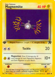
Magnemite (Team Rocket)
In third place we have Magnemite from Team Rocket. This artwork demonstrates Tanaka’s dedication to simplicity. In fact, it is one of the simplest and most minimal artworks within the entire Pokémon TCG.The simplicity of the artwork perfectly conveys the simplicity of Magnemite.
2. Totodile (Neo Destiny)
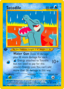
Totodile (Neo Destiny)
In second place we have Totodile from Neo Destiny. This card is one of Tanaka’s more abstract artworks. The artwork appears to depict Totodile in some kind of desert, celebrating what are perhaps the first rains in a long time. It is notable that the colours of the card’s background, blue, red and yellow, mirror the colours of the Totodile itself. This provides a particular unity and harmony to the artwork.
Overall, this card is an excellent demonstration of the focus that Tanaka often takes upon more abstract artistic elements, such as shape, colour, form and gesture, rather than true-to-life visual depiction. It is not entirely clear what this artwork is intended to depict – but it is nevertheless highly visually compelling.
1. Weedle (Neo Discovery)
Weedle (Neo Discovery)
In first place we have Weedle from Neo Discovery. This might be the first time a Weedle card has ever taken first place on any list. However, just LOOK at this card. Tanaka’s depiction is so simple, yet so perfect.
This card is one of Tanaka’s more humorous artworks, with the Weedle staring blankly toward the sky as it floats aimlessly on the oversized leaf. One gets the impression that the Weedle has perhaps accidentally fallen onto the leaf, and has now just accepted its fate – at least until it drifts randomly to the water’s edge. However, although the Weedle appears to be in a pinch, it is nonetheless a very relaxing artwork. After all, wouldn’t we all like to float aimlessly in the sunshine sometimes?

In a Pinch
Tanaka’s simple and minimalist style perfectly complements the simple and relaxing idea of the artwork. Her signature two-dimensional style helps to simplify the artwork into its most basic shapes and elements. Additionally, the simple blocks of pure colour harmonise in a calming and satisfying way.
Overall, this card takes the top spot because it perfectly encapsulates Tanaka’s work. It is a simple idea, executed in a colourful and unique way, which brings interest to the most basic Pokémon imaginable.
Conclusion
Miki Tanaka is one of the longest-running artists within the Pokémon TCG. Her work celebrates simplicity and minimalism, and demonstrates that good artwork does not need to be detailed and complex. We can only hope that we will see many more of Tanaka’s unique and beautiful artworks in the future!
Gallery of Tanaka’s Work